Last week I got my hands on a roll each of two new types of fine art paper from my friends at Breathing Color, Pura Bagasse Smooth and Pura Bagasse Textured, so today we’re going to take a look at these excellent new offerings.
First off, one of the most exciting things about these two new media types, is that “Bagasse” is the pulp produced as a byproduct of raw sugar production. This pulp is mixed with cotton to make this paper’s base, so it is the perfect solution for the quality loving photographer or buyer, because the print quality is incredible, as we’ll see, and it’s eco-friendly. No trees were harmed in the production of this fine art media!
Until now, my favorite matte fine art paper has been Breathing Color’s Pura Smooth, and this is still a beautiful media, but if I can get the same archival quality without harming trees in the production, this is a no-brainer for me.
Archival Certification on the Way
Now, as of August 2015, neither of these papers are actually certified as being archival, but that’s just because these papers are so new, they are still in the certification process. The word from the Breathing Color team is that both of these Bagasse papers are en-route to the Fine Art Trade Guild for archival certification, and they are very confident that they’ll pass, because the coating formulation is quite similar to that of the Pura Smooth and Pura Velvet which are both already certified.
[UPDATE: The Bagasse papers are now archival certified. Yey!]
I actually include a certificate of archival quality with Pura Smooth fine art prints that I send to customers, and I think that this adds a nice touch. I fully imagine that by the time I’ve finished my current stock of Pura Smooth, there’ll be a similar certificate available for both of these new papers too.
So, I’ll be replacing my Pura Smooth matte media with Pura Bagasse Smooth, but I’m also very excited about the new Pura Bagasse Textured paper, because I used to love printing to Hahnemühle’s Museum Etching paper which was a beautiful textured media. I moved away from this paper some five years ago, when I found Breathing Color, but I always missed this textured fine art media, so I was very excited to hear about this new offering.
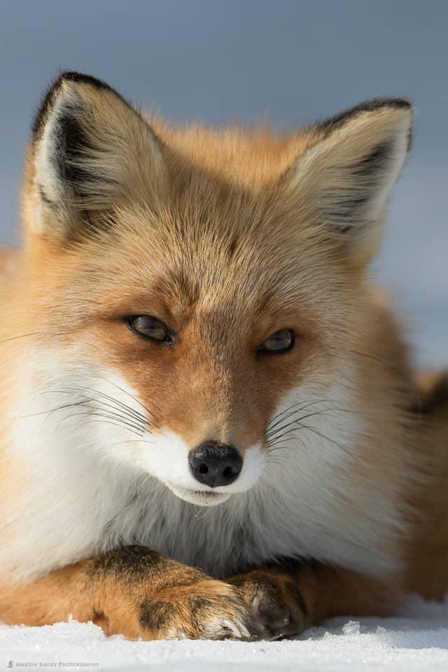
We’ll get into some more details on the paper shortly, but first let’s look at a few photo of some prints I’ve made on Pura Bagasse Textured. First of all, I printed this photo (right) of a Northern Red Fox. I chose this image to see how the texture of the paper added to the texture of the fur and snow, as well as that pale blue background in this photo.
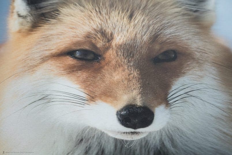
Here is a photo of a part of the print, taken at an angle looking up at the print towards window light coming into my studio. This is perhaps one of the best angles to appreciate the texture that we’re looking at here (below). Click on this to view it larger if necessary.
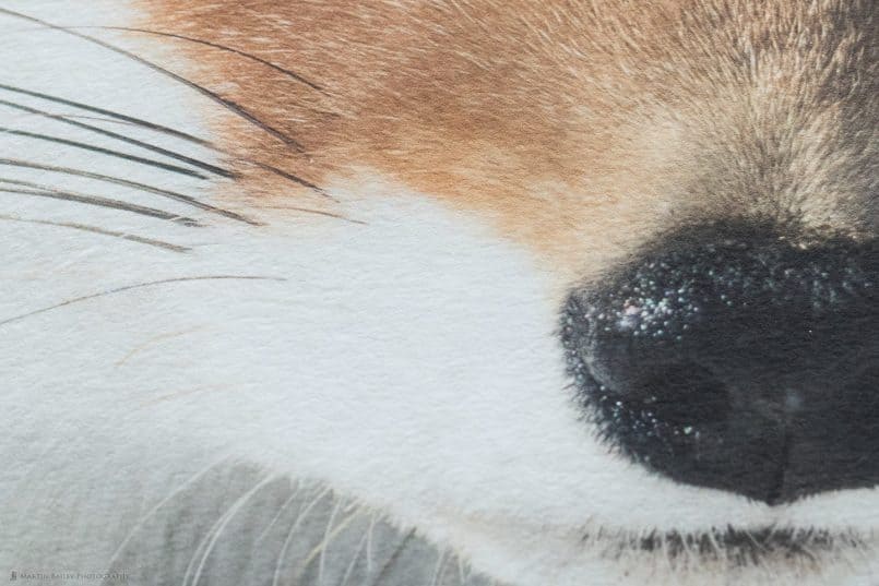
Here too is a 50% magnification crop from the above photo, just of the fur to the left of the foxes nose, which I thought was probably one of the most beautiful parts of the print. The texture really adds so much to the final print here (below). You can see that the texture in the paper has modified the texture in the foxes fur, really enhancing it in my opinion.
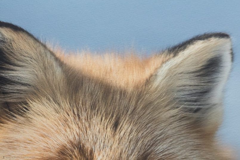
Here is a photo of the top of the foxes ears with the blue background, which is of course just a very smooth blue in the original, and again here, you can see how the texture of the paper has enhanced the image (below). It gives the photo a painterly feel, and for me, because the texture is organic, subtly different for every square inch of this paper, it provides a special uniqueness to each print, that you don’t really get with smoother media.
Another aspect of these papers that I’d like to touch on, is there incredible gamut, or ability to reproduce a wide range of colors. I create my own ICC profiles with X-Rite’s i1 Photo Pro 2 calibration tools, and this gives me the ability to take full control over my printing. I won’t go into detail on this today. If this concept is alien to you, consider picking up my Making the Print ebook from Craft & Vision.
What this does for me though, is enables me to print to my printer with the absolute best color reproduction possible, and bring out the best in the media that I use. If you don’t have the ability to create your own ICC profiles, not to worry. The Breathing Color team have great quality profiles available for you to download for many of the popular printers that are available. The important thing is to ensure that you turn off printer color management, and print with your own profile, be it home-grown, or from Breathing Color.
Fly in the Face of the Gamut Gods
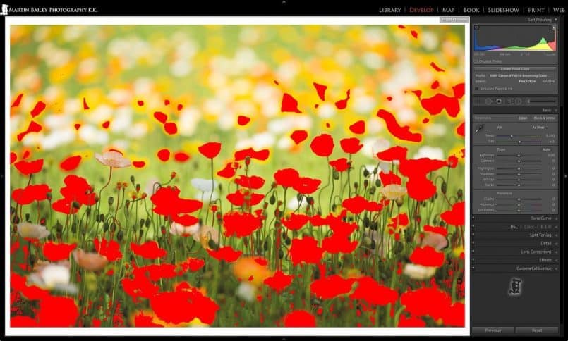
Before I print anything, I hit the D key in Lightroom to jump to the Develop Module, and I then hit the S key, to activate Soft Proofing mode, so that I can select the ICC profile that I will print with, and check that the image will print OK.
As you can see in this screenshot of a flowerscape photo that I printed, Lightroom tells me that there are large areas of the image that should not print accurately. These are all of the bright red patches, which are called gamut warnings. You can adjust the saturation and change your image to bring the colors into gamut, but more and more, I’m simply choosing to ignore these gamut warnings, and just print anyway, as I did here when I sent this photo, without modification, to the printer and my roll of Pura Bagasse Textured paper (below).
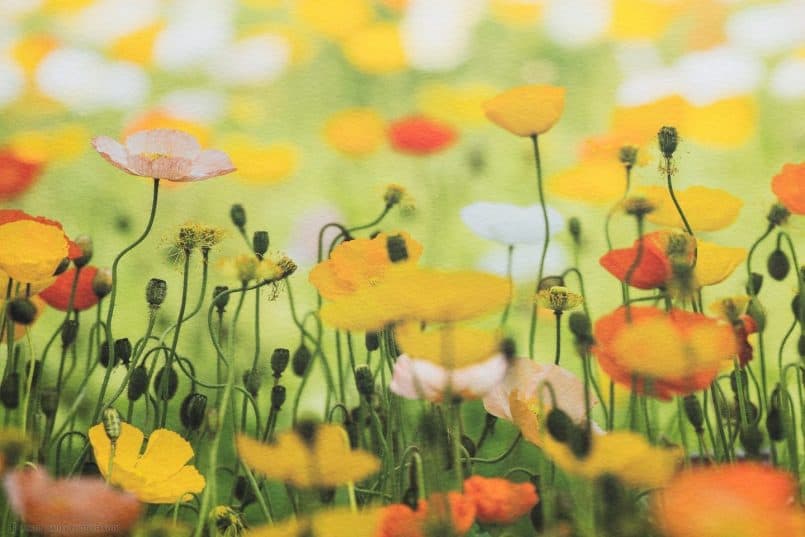
Here now is a photo of a part of the image. I didn’t modify this image in any way for print. I just ignored the gamut warnings, and printed it out, and the printer did a fine job (below). If you aren’t sure things will work out, it’s probably more intelligent not to go straight for a 17 x 24″ print as a test, but I’ve been printing like this for long enough to know that it’s often fine to just go ahead and print.
As you can see in this photo (above), once again, the texture of the paper has added a beautiful painterly feel to this flowerscape photo. It’s almost as though I’m looking over the shoulder of someone doing a watercolor painting of the scene that I was photographing. Really, I can’t tell you how happy I am that Breathing Color have added this option to their range of fine art papers.
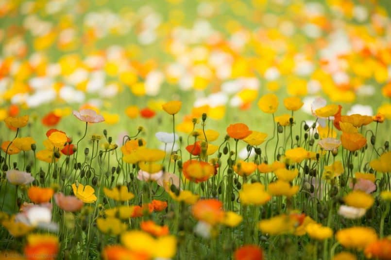
Before we move on, to give you a better reference than the soft-proofing, gamut warning version of this photograph, here’s the original (below).
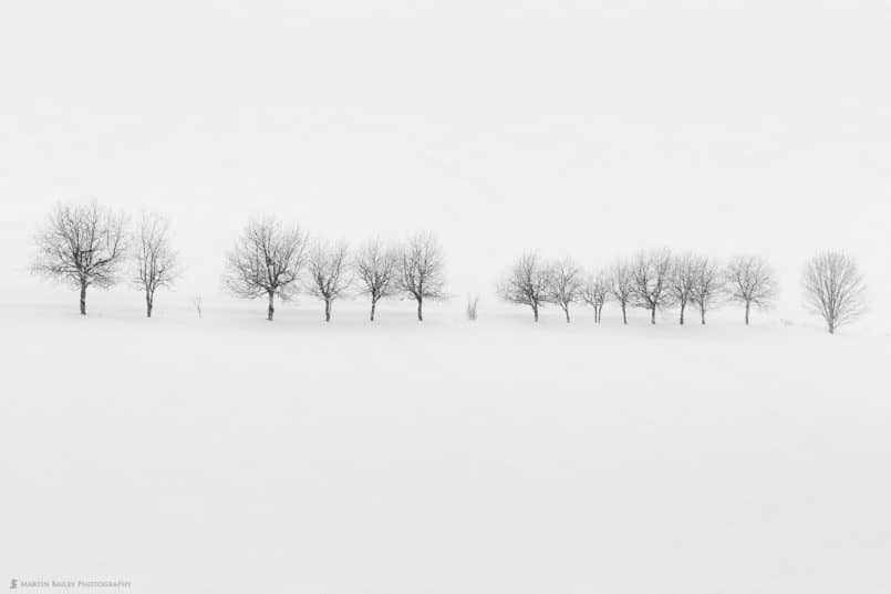
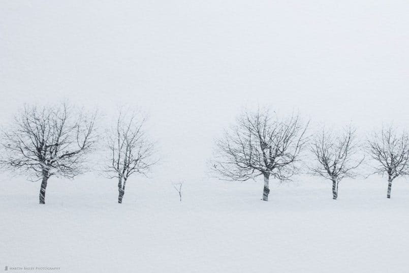
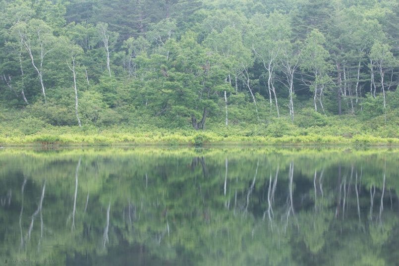
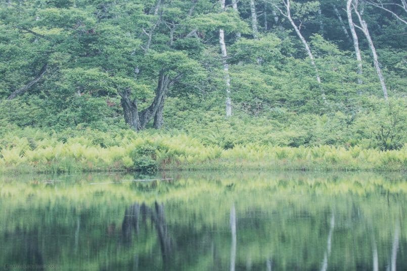
Let’s look at one last example of the beauty of the Pura Bagasse Textured paper before we look at the Smooth. This is a photo from my Hokkaido Landscape Photography Adventure Tour (below). With a photograph like this, you can certainly go either way, and print on Smooth or Textured, because the smooth looks beautiful too.
Here’s a photograph of a portion of the print (below). You can see once again that the texture adds so much to the photograph here. It takes the print to a different place, that I for one really enjoy.
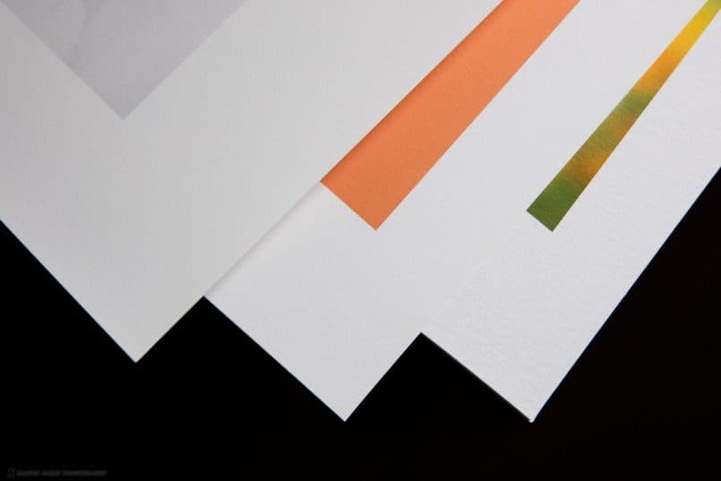
So, what about Pura Bagasse Smooth? The coating is a very similar formula to the Textured paper, although Bagasse smooth sometimes seems to have a very slight yellow tint to it. In this photo, I have added a print on Pura Smooth, which you can see is not as bright a white as the two new Bagasse papers (below). Here you can see Pura Smooth on the left, Bagasse Smooth in the center and Bagasse Textured on the right.
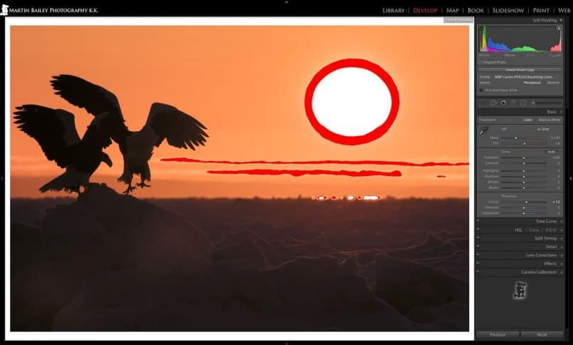
The slight difference in the color of Bagasse Smooth is perhaps coming in to play here, but with my ICC profiles created with the same printer and exactly the same patch sets, I’ve actually found that my Bagasse Smooth profile seems to handle yellows just a tad better than the Textured paper. As you can see in this soft-proof screenshot, Bagasse Textured was showing a patches of the image that were supposedly out of gamut.
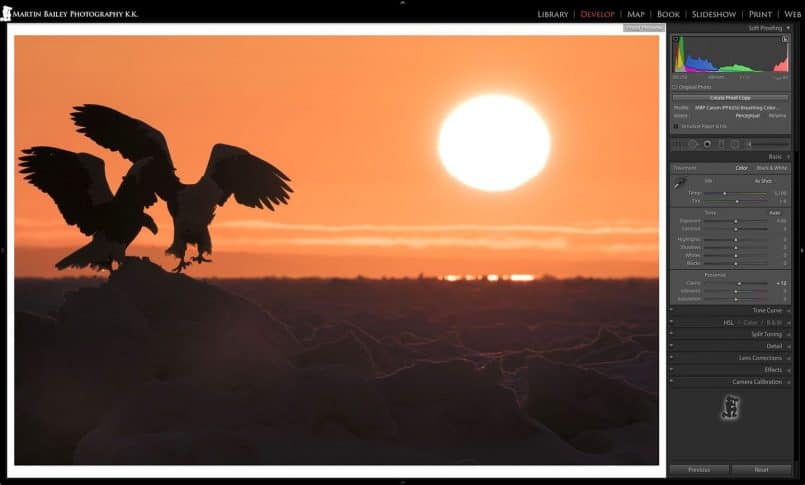
Here though (below), is a screenshot of of the same photo, without changing anything, other than selecting the Bagasse Smooth ICC profile to proof. As you can see, there are no gamut warnings.
I’m sure that this photograph would print just fine on the Bagasse Textured paper, as we saw earlier, with the flowerscape image, you can just fly in the face of the gamut gods and it doesn’t really seem to hurt that much, but I wanted to see this image with a smooth sky anyway, so I printed this on Bagasse smooth, and here is a photograph of the print (below).
OK, so let’s look at one last print on Bagasse Smooth, before we look at a few final details about these two new papers. This image (below) is actually the first photograph that I’ve made time to print so far, from the new Canon EOS 5Ds R that I reviewed recently.
All of the other images that we’ve look at today were from images of around 20 megapixels, with a native resolution of somewhere between 240 and 280 pixels per inch when printed at 17 x 24″ which is the print size I used in these tests. When the native resolution drops below 300 ppi, I generally turned on the Print Resolution check box in the Lightroom Print module, and set it to 300 ppi, which forces Lightroom to upsize the image a little for print.
Incredible Detail
With the 50 megapixel images from the 5Ds R though, I had a whopping 418 ppi native resolution for this image at 17 x 24″, so I unchecked the print resolution check box, and let Lightroom send everything it had to the printer. I print at 600 ppi anyway, so this was not going to go to waste. Here is a photo of the center of this image printed on Pura Bagasse Smooth (below).
I know that this is not going to come across fully in the Web sized images I’m posting here, but I think you’ll still be able to appreciate the incredible amount of detail in this print, again, shot looking up at the image with light from the window in my studio. This is of course not only a tribute to the image quality of the 5Ds R, but to these beautiful new Pura Bagasse papers from Breathing Color. Without a quality paper to print to, this level of detail just isn’t possible.
OBA Free
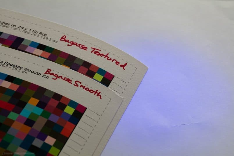
One other important aspect of these two new papers, is that they are both OBA free. That means there are no Optical Brightener Additives in these papers. OBAs are commonly found in cheaper media, and are almost always in office paper, which is why I can show you that there are none in the Bagasse brothers, by shining a small LED UV light onto them, as you see in this photograph (below).
OBAs work by absorbing light from the invisible ultra-violet end of the spectrum and emitting light in the visible blue/white range of the spectrum. This is what makes media that include OBAs look whiter and brighter. As you can see in this photograph, the office paper in the background reflects the UV light, but the Bagasse papers do not, proving that it’s OBA free.
Why are OBAs bad? Well, they decrease the longevity of fine art paper by accelerating metamerism and causing color shifts and yellowing over time. Although there are some archival fine art papers out there that do contain OBAs, it’s generally best to avoid them whenever possible.
I should also note that there are no OBAs in Pura Smooth either, so that is not an issue, but if you consider how much whiter the Bagasse papers are compared to Pura Smooth, as we saw in that example photo earlier, I think the Breathing Color team have done a cracking job with these two new offerings.
Printable on Both Side
One last detail that I’d like to include for good measure, is that the Bagasse papers are printable on both sides. That means that you could use this paper for high-end note cards and photo books etc. I’ve created a large batch of New Year post cards for a customer in the past, and I’d have loved to have been able to print on the back of those cards for my customers back then. Now I can do that.
Conclusion
OK, so let’s wrap this up. It will come as no surprise after that review that I give both of the Pura Bagasse papers a huge thumbs-up. These are game changing fine art papers. Heavy, at 320gsm, so prints on this media just ooze quality, and they’re bright white, and can easily cope with extremely high resolution images.
You couldn’t go wrong with this media even without the eco-friendly aspect that this paper is made from a byproduct of sugar production, but when you throw that into the mix, it makes this media an even more attractive addition to your printing workflow and fine art product offering. Think about that. If you sell prints, you can also market your prints as eco-friendly, and I’m sure before too long, that will include archival certification as well.
I do hope you’ve found this review useful. If you decide to pick-up these or any of Breathing Color‘s products, you can get a $20 discount by using our code MBP20. You can use this code for orders of any amount, even if you are only ordering a $19.95 Sample Pack, so if you are new to Breathing Color, give this a try.
Housekeeping
One last bit of housekeeping before we finish. By the time I release this, I’ll be on my way to Namibia for almost three weeks. I was just able to make time to finalize this review before I left, but I didn’t have time to fill the pipe with episodes for the following two weeks. Next week though, I’m going to share a video interview that Paul Griffiths did with me a few weeks ago for his Live and Uncut show. I won’t have time to add any intros etc. though, so don’t be surprised when we just launch into a totally different show. It was a good chat though, so I hope you enjoy it.
See you on the flip-side!
Show Notes
Breathing Color’s Web site: http://www.breathingcolor.com/
See Breathing Color’s Fine Art papers here: http://www.breathingcolor.com/action/bc_shop/164/
Subscribe in iTunes for Enhanced Podcasts delivered automatically to your computer.
Download this Podcast in MP3 format (Audio Only).
Download this Podcast in Enhanced Podcast M4A format. This requires Apple iTunes or Quicktime to view/listen.



Excellent review. I will be trying the Bagasse Smooth tomorrow. The ICC profile is not available online but an email to Breathing Color will produce the profile quickly.
I need to get better at making my own profiles.
Thanks for letting me know Richard! I must have assumed they were already there. I’m sure they’ll be posted soon.
These shots of printed images (not smooth ones) reminds me of one of the traits of impressionist’ paintings – you must get closer to appreciate the details (bold brush strokes, etc). Looks fantastic.
Yes, they do for me too Fulin. Good observation. I really like this kind of media.
Loving the review, Martin!
Out of curiosity, which rendering intent are you most often using when you find the gamut warning alerting you of lots of out-of-gamut colors in a given image?
Thanks Justin!
Always Perceptual rendering intent, as that’s what I print with.
Big fan of pura smooth, I want to try this. I still have a stock of Canon Museum Etching so I’d try the ‘Bagasse Smooth’.
Too bad the coupon doesn’t work for me. I might have used it a while back for the pura smooth 😉
Yes, I think the coupon is only for first time customers. 🙂
Thanks for the paper review. The winter here in Edmonton is Meh so I feel like playing around with different printing paper again. I was just going to order some from Breathing Color but then I found they have only two profiles for my printer model. 🙁 Oh well, one of these day’s I’ll have to replace my old printer. 🙂
Hey Charlie, which printer model are you using? We have some profiles here at BC which are offline. Maybe it’s something I can send over to you.
Hey Justin. That would be great. I have a Canon Pixma Pro9500.
Charlie, I’m sad to say we actually don’t have much for this printer. You’re right, it’s quite a dated model at this point and unfortunately we do not have it in house to create profiles. Looks like the profiles we have are for Lyve and Crystalline canvases. You can likely get good results having the printer handle color management, though this isn’t most ideal. If you decide to invest in a newer-model printer, we do have all recently-released models profiles for our entire product line.
No worries. My plan is to print lots and lots so it will wear out & break and then I’ll have to buy a new one. If done right it wont be too long 😉
Thanks for the review, Martin. I’ve been experimenting with the Bagasse papers and am likely going to print an upcoming exhibit on them. (There’s a slight chance I’ll decide to stick with Pura Smooth.) Do you have any additional observations about these papers in the months since this review was published?
Note: in case you’re not aware of it, FATG certification is now posted for the Bagasse papers. I still don’t see profiles for my printer (a 3880) for download, but BC graciously offered to make a custom profile for my printer, which involved me sending physical prints to them of targets printed on my printer.
There’s a question I’ve posed to BC and not gotten a satisfying (to me) answer yet. Maybe you have a comment. In the data sheet for the Bagasse papers they are touted as “water resistant”. This also appears in Hahnemuhle data sheets, so I’m guessing it is inherited from the properties of the base paper in BC’s Bagasse product. I don’t yet understand, however, what user benefits are associated with such water resistance. If you have ideas, I’d welcome them.
One more question, which I don’t remember being addressed in your blog posts, but perhaps I missed it. Have you ever pursued the possibility of displaying prints on paper without glass or plexi protection (but presumably with varnish)? I’m seriously pursuing that possibility for this next exhibit (and therefor likely with either Pura Smooth or Bagasse Smooth). I’d welcome any comments you may have.
I look forward to seeing you in January! (And I just watched your Namibia video today…very nice!)
Thanks, as always, for your informative posts.
Mark
Hi Mark,
I don’t really have anything to add, other than I have continued to be astounded by the quality of these two Bagasse papers. I’ve printed on them many times since this review, and absolutely love them.
I hadn’t noticed that the archival certification had come through. Thanks for the heads-up on that Mark!
I’m afraid I don’t have any additional information on the water resistance statement. It’s not something that I will ever have to depend on, so I haven’t really given it much thought. Is it important to you that this media is water resistant? If it is, I can ask for more information, or Justin Bodin from BC might reply, as I think he’s subscribed to comments for this page.
I’m looking forward to seeing you too next January, and thanks for watching the Namibia video! 🙂
Regards,
Martin.
Thanks, Martin. Good hear that you continue to be a Bagasse enthusiast. I don’t think that water resistance is critical to me, but I’m definitely curious about what it means, since it is in the Bagasse specs and not in the Pura specs. Let’s see if Justin comments.
Did you have any comment on my final question about displaying paper prints without glass or plexi?
Mark
Oops! Sorry about that Mark. I missed your last question.
I’ve not actually displayed paper media prints without glass or plexi, although I did laminate a fine art matte print many years ago. I had a little bit of Lyve Matte laminate left in my roller tray after laminating some Lyve canvas, so I applied it to a print on Pura Smooth, I think it was, and it applied well and looked great.
You’d need to check with BC about laminating your chosen media, just in case things have changed, but I definitely think it’s doable.
Thanks, Martin. I’m already having the no-glass display conversation with BC, but thought you might have had some relevant experience in this area.
Mark
Hi Mark,
I wanted to address a couple of things you and Martin were discussing.
First, here is a link to the Bagasse profiles for the Epson 3880. Sorry these aren’t on the web yet, we’ve been having a couple of issues with the profile upload tool that we’re working on resolving. https://www.dropbox.com/s/q9a4mwjydt9qoga/BC_BAGASSEPROFILES_3880_MK_WCRW.zip?dl=0
Secondly, the “water resistant” attribute mentioned on the data sheet does in fact mean that you can roll or spray most varnishes over the print. Some papers will not stand up to the process of rolling liquid laminates. I can see where this simple “water resistant” mention can be quite confusing, so I’ll make a note to have my team clarify that on the data sheet.
I think the above answer addresses your last concern. I would say that varnishing fine art paper prints is pretty rare, from what I hear, but is certainly done by some.
Take care,
Justin Bodin
BC
Thanks, Justin. I appreciate that you’re monitoring this thread. Thanks also for the link to the 3880 Bagasse profiles; could you provide a similar link for the corresponding 9900 profiles? I’m working with a community photo center that has a 9900 and I’d like to be able to print on Bagasses there, also.
Your comment on the water resistant phrase make perfect sense to me. As I noted, however, the phrase does not appear in the data sheets for the original Pura papers (to my recollection). Is this attribute actually a significant difference between those original Puras and the Pura Bagasses? (I’ve been primarily using Pura Smooth, recently, but (partly triggered by Martin’s enthusiasm, confirmed with my own experience), am considering switching to Bagasse Smooth for my upcoming exhibit.)
Actually, while I have you, there is one more Bagasse question. I’m using Watercolor Paper Radiant White as the media type in all my work with the Bagasse papers. I don’t know the considerations that went into picking that Epson media type as a base for printing on BC papers, but there appear to be considerably more advanced (or at least expensive) Epson matte papers that superficially would seem more likely to be a match with the Bagasse papers in areas such as ink load that they would tolerate. Any comments here?
Mark
Sure thing! Here are the Epson 9900 profiles: https://www.dropbox.com/sh/4cw584q7zqiii8i/AABggFbb7MOujDF2rW0uReOqa?dl=0
The Pura Smooth and Velvet will perform very similarly to the Bagasse papers in terms of varnish application.
Good luck with the exhibit!
I like the paper as well, lovely structure. But I really wish they could remove the slightly pink/rosa tint it has. On it’s own perhaps not that obvious, but when evaluating different papers it struck me. Looking up the L*a*b* whitepoint, it does register around an a* 2, confirming the observation. In some lighting it’s too much of a difference to me (often when not directly lit), compared to other neutral a* papers.
And thanks, Martin, for the content you share here. Appreciated. Getting my feet, or rather paper, wet currently in varnish testing on FineArt papers. Not as easy as on canvas.